This article is featured in Issue 2 of Dysfluent Magazine. The text does not feature any stammering letters as it is not a transcription.
Copyright 2025 © Dysfluent. All rights reserved.
This article is featured in Issue 2 of Dysfluent Magazine. The text does not feature any stammering letters as it is not a transcription.
Since issue one launched in 2019, stammering pride has emerged as a compelling movement in the cause for self-affirmation, dignity and equality for people who stammer. But what does it mean to be proud of something you associate with struggle and pain?
For some, this is radical thinking. As a person who stammers, I get that it’s not simple. I’m eager to platform stammering pride because I believe in it. It’s given me the understanding that stammering is part of a larger story. Seeing it as a disability and as natural variation moves it out of a medical space of needing to be fixed and into a social justice effort that celebrates human diversity. As the world becomes more understanding of difference, why can’t stammering be embraced too?
This is not to underplay anyone’s experience of struggle. Stammering pride is full of contradictions. That’s why this issue goes beyond the personal tales of stammering that we’re familiar with and instead digs deeper, pushing the conversation forward, sometimes leaving more questions than answers. Stammering isn’t black and white or even isolated——it intersects with politics, disability, activism, art, design, identity, time, psychology and more.
Dysfluent is a facilitator of challenging viewpoints. Penny Farrell’s description of acceptance contrasts Patrick Campbell’s interpretation. Kristel Kubart’s uplifting interview on stammering freely sits beside an exchange with organisations who help to ‘overcome’ stammering. As Puneet Singh Singhal and Maya Chupkov lead the way in stammering advocacy, Jack Nicholas warns of pride’s toxic positivity. With the help of Audra Wolowiec, Paul Aston, Willemijn Bolks, JJJJJerome Ellis and the Making Waves team, this issue shows how art is a transformative force in visualising and expressing stammering pride. The large statements on the magazine’s cover promise an issue full of pride and positivity. But stammering is not straightforward. Unfolding the front cover reveals the complicated relationship between pride, shame, acceptance, rejection, celebration and prejudice.
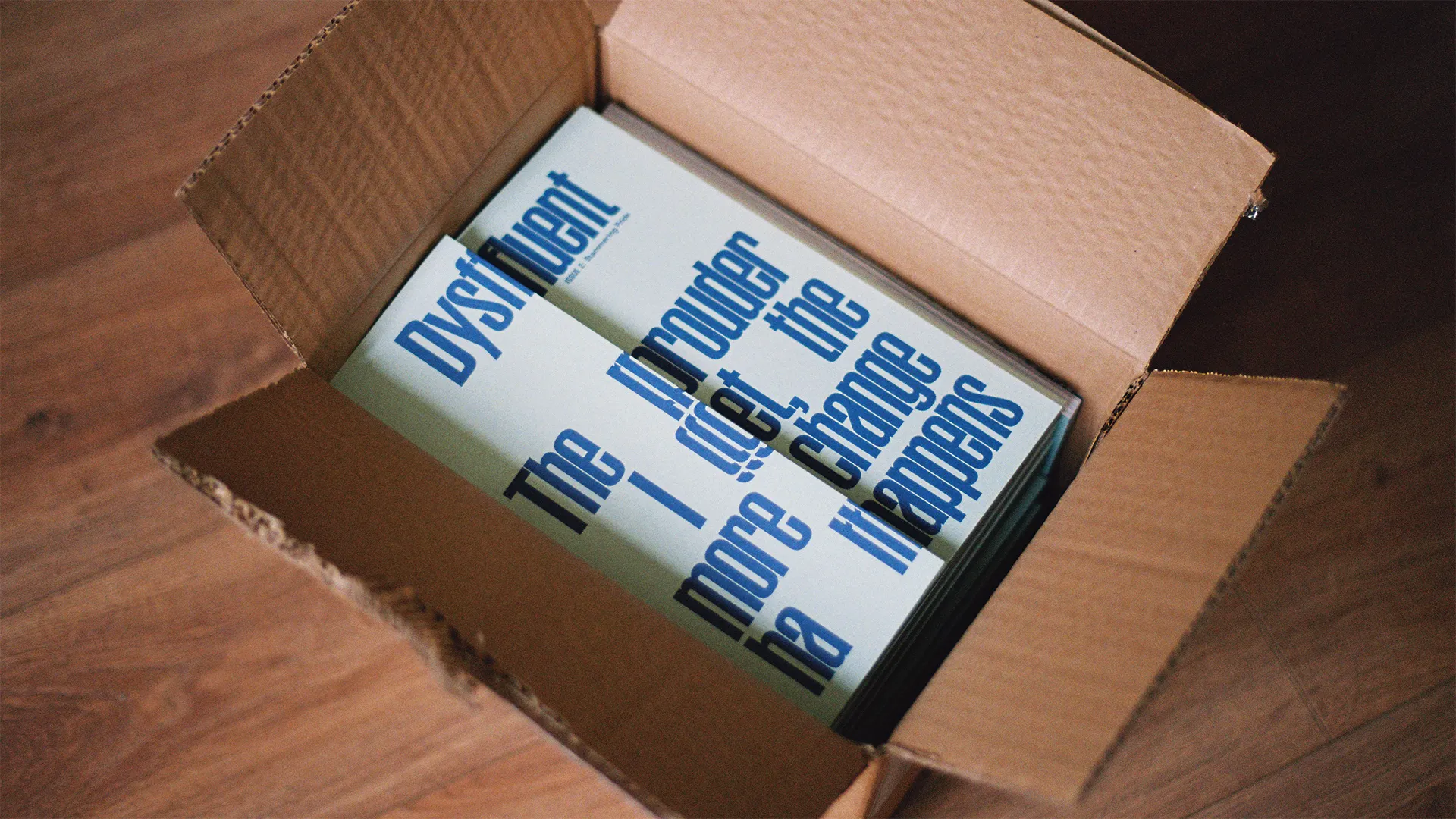
The design of this issue leans on typography as a powerful expression language. Almost all interviews were recorded and transcribed to retain the essence of a conversation. Our typeface Dysfluent Mono reveals the uniqueness of everyone's stammer: Patrick’s patient prolongations, Jack’s intermittent blocks, Kristel’s delicately repeating consonants, Puneet’s full-word repetitions and Maya’s mid-word stretches.
Pull quotes and sound bites are staples of the editorial format. With this issue, ‘pull quotes’ remain in their paragraphs, challenging the idea of the perfectly-said phrase. Each interview also features an expressive typographic illustration, inspired by that person’s voice. These posters twist, disregard and play with legibility. They creatively question society’s obsession with hyper-fluency which leaves little room for organic moments in language.
The overwhelmingly positive response to the first issue of Dysfluent inspired the enormous effort that went into this one. Receiving the Developing Your Creative Practice grant from Arts Council England in 2022 allowed us to set the foundations for a Dysfluent creative practice with the support of mentors Patrick Campbell, Daniel Caulfield-Sriklad, Kimberley Dines and Nathan Smith.
Dysfluent has given me so much, personally and professionally. In a society that offers harmful representation, its mission of spotlighting the lived experiences of people who stammer continues unwaveringly——as it evolves from a stammering typeface, to a stuttering pride flag, to more issues of this magazine.