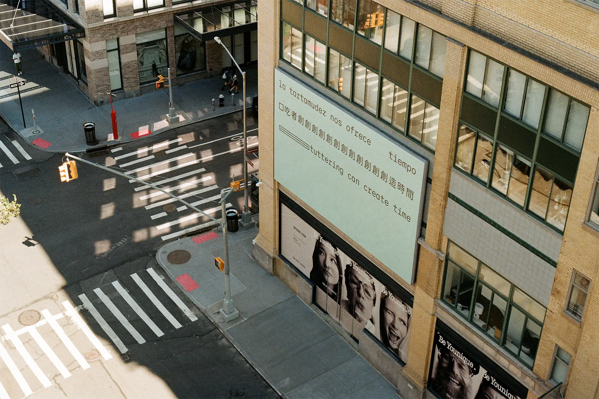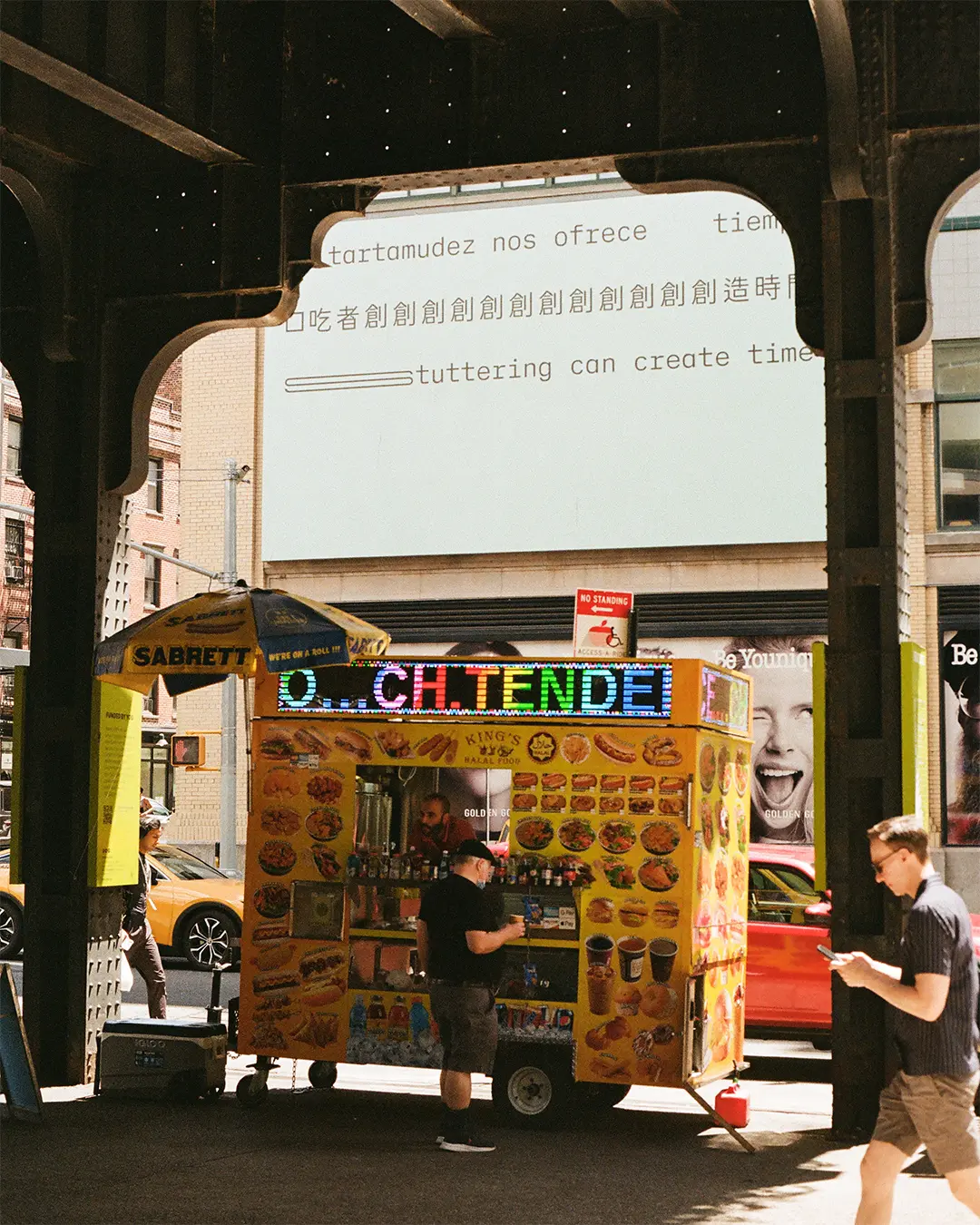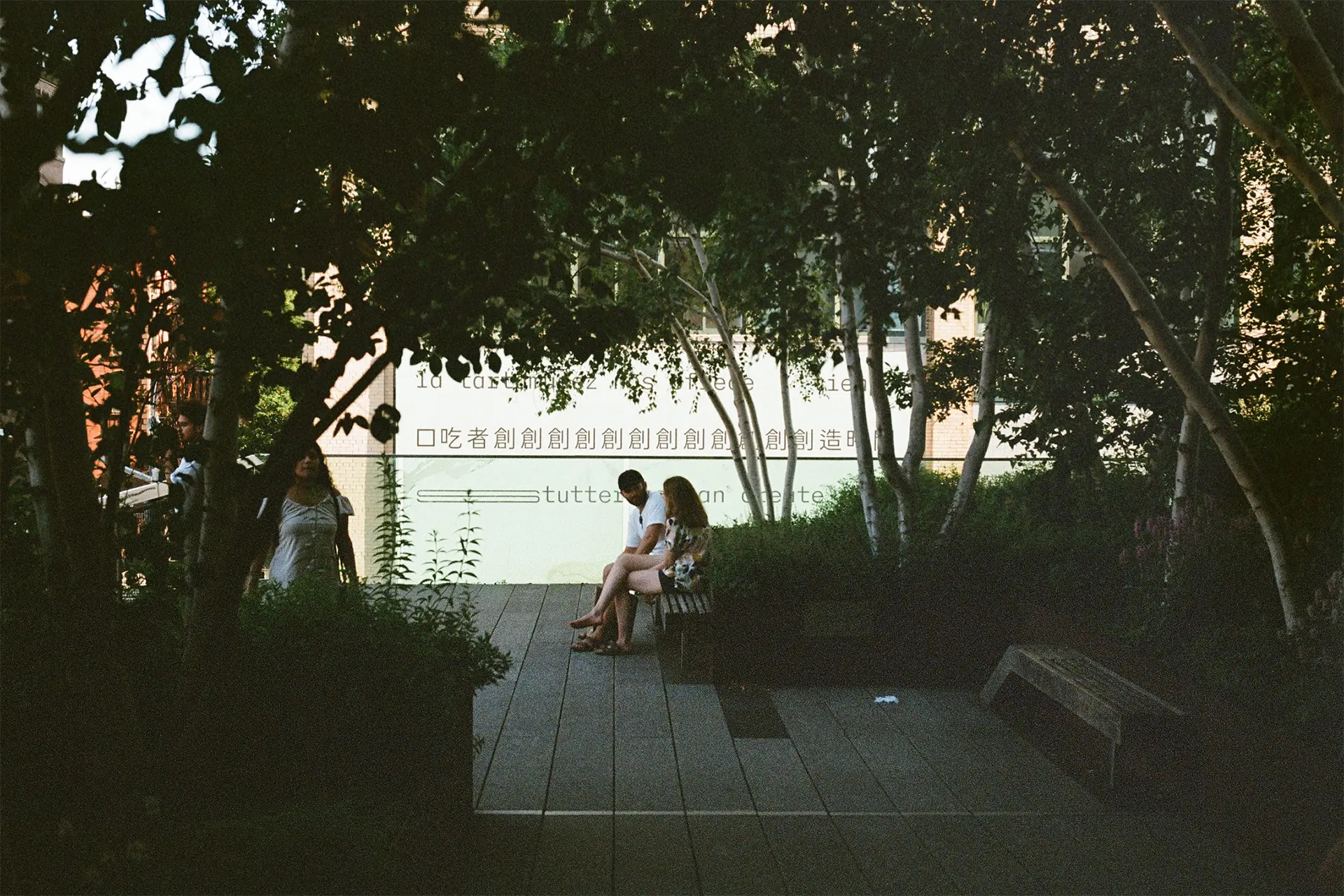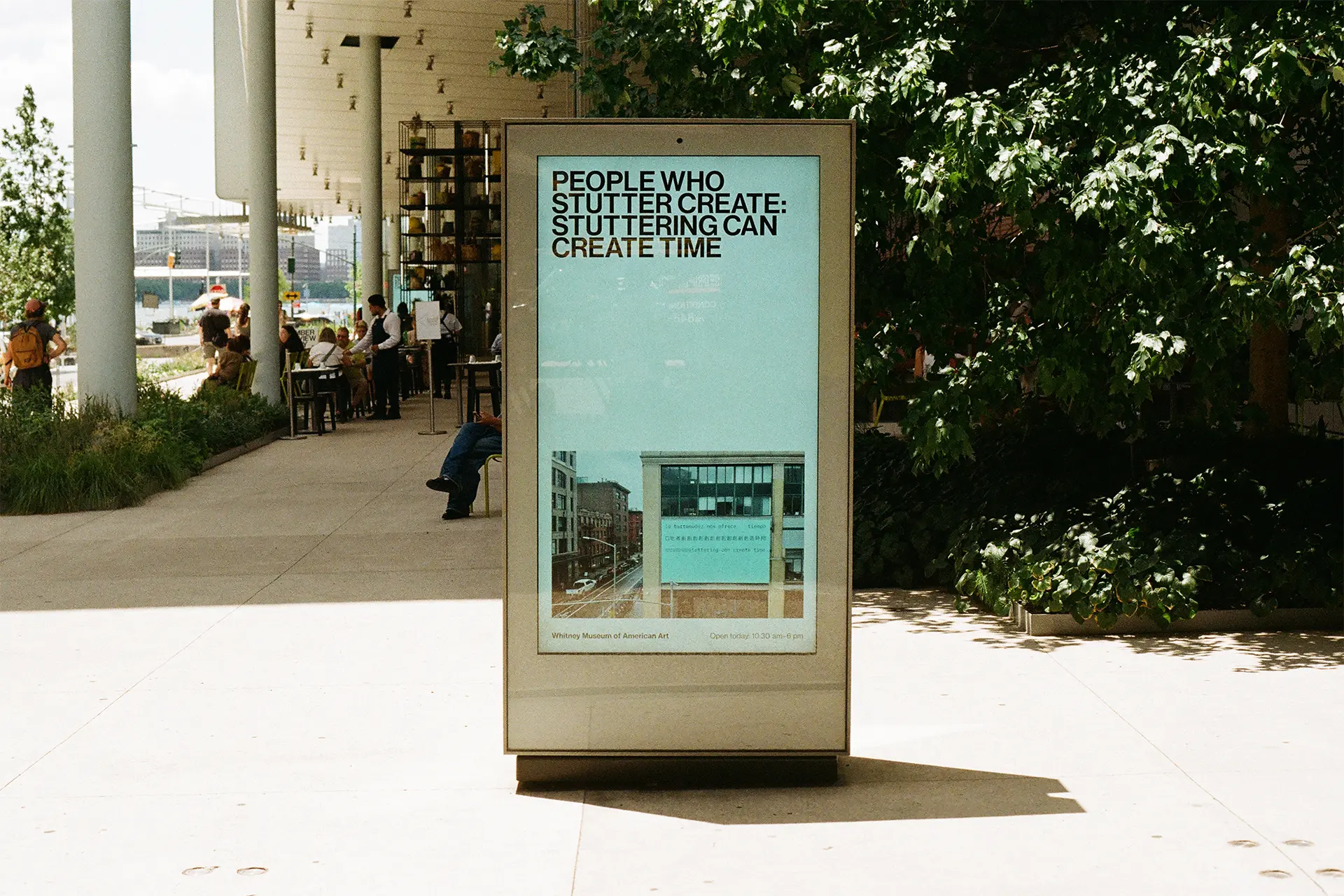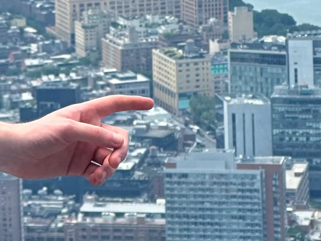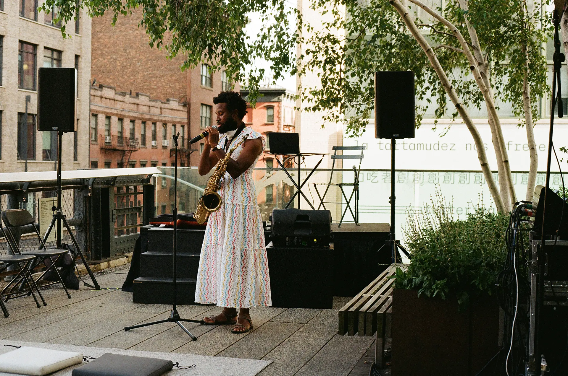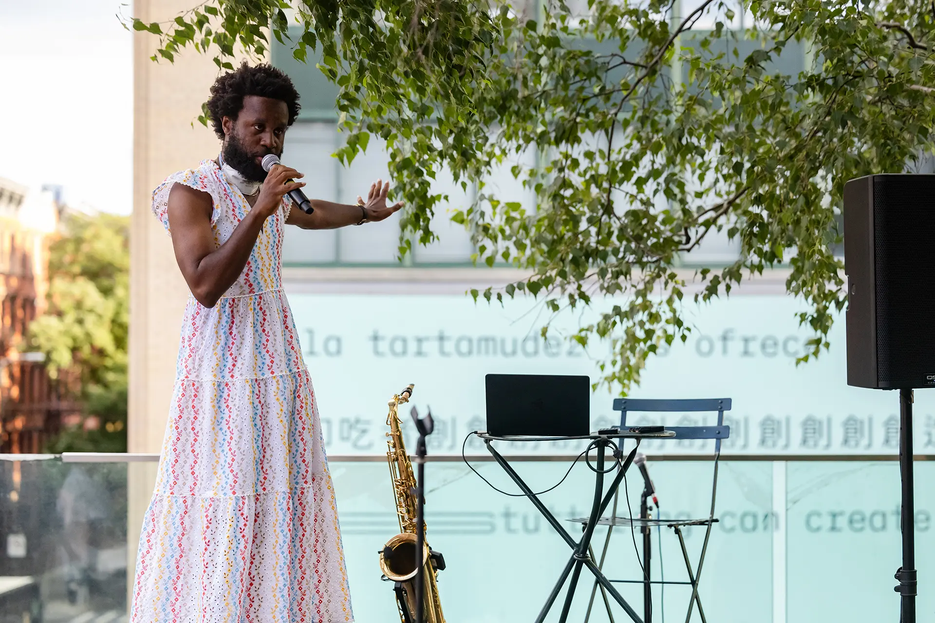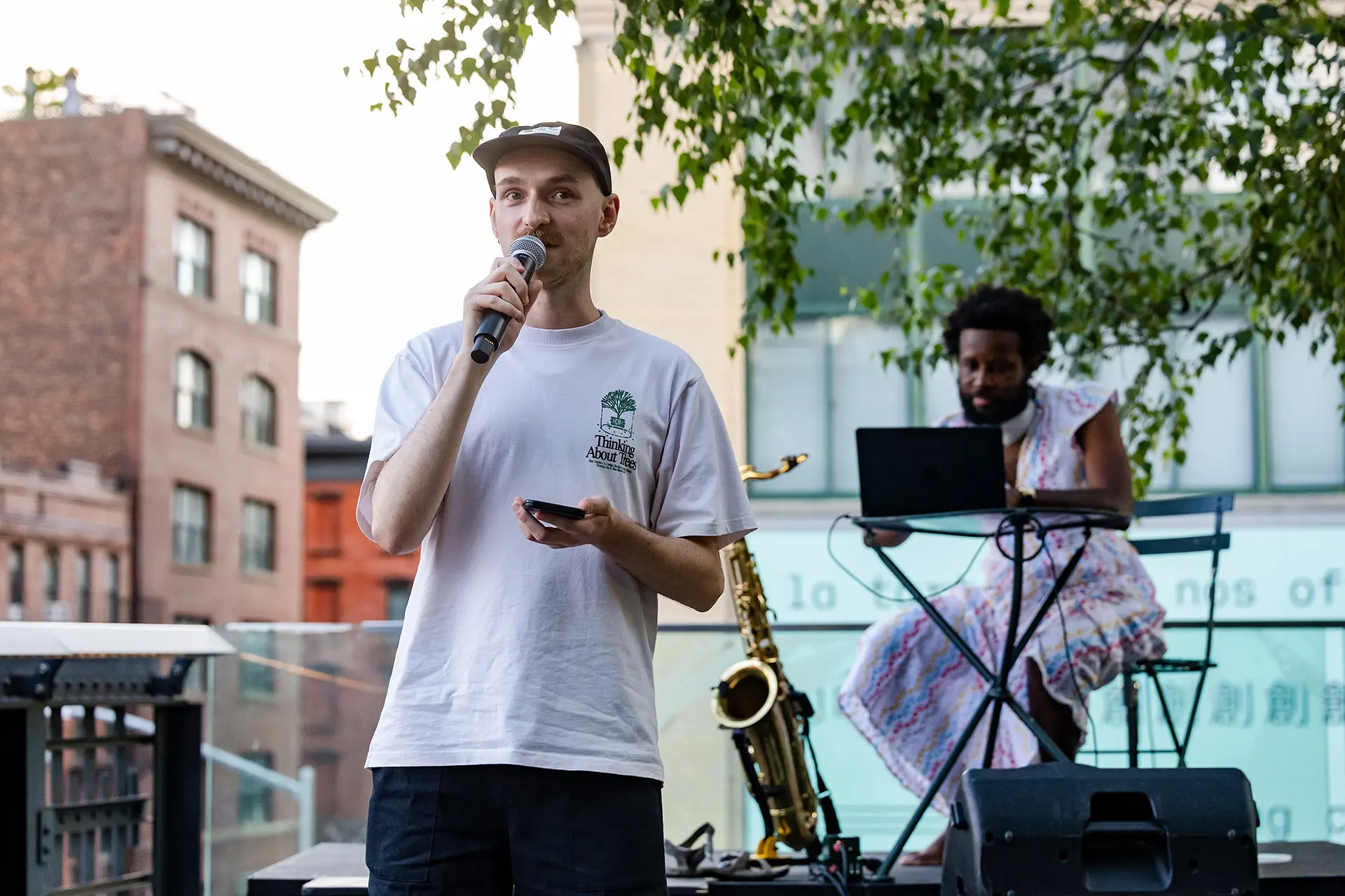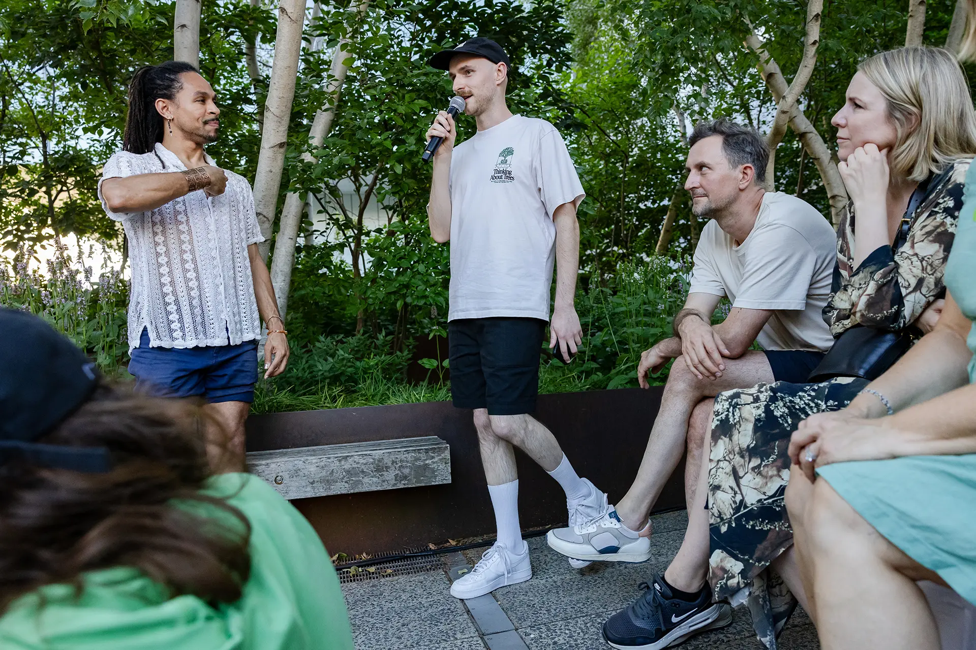
Whitney Museum, New York City, NY, USA
March–September 2024
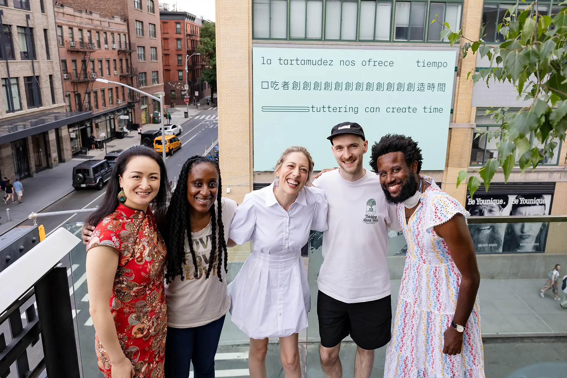
8.8 x 5.1 metres (29 x 17 feet)
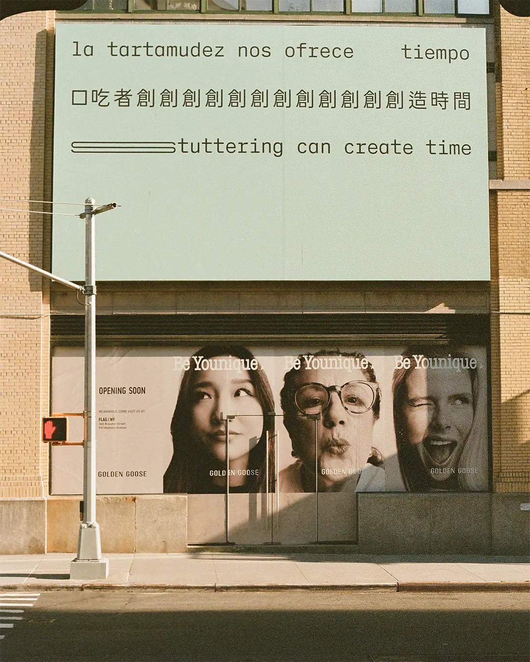
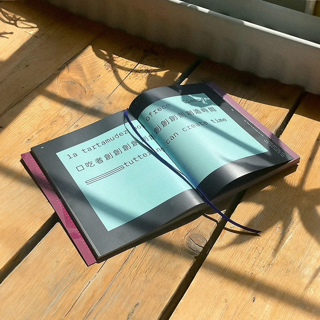
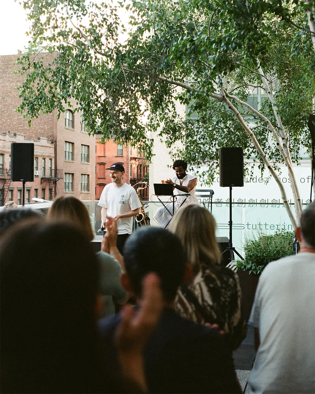
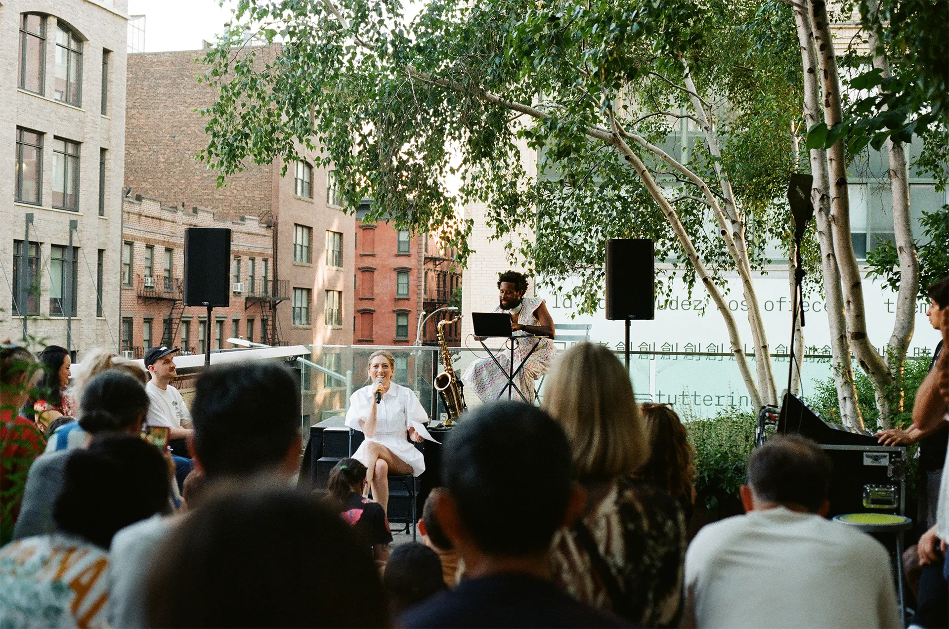
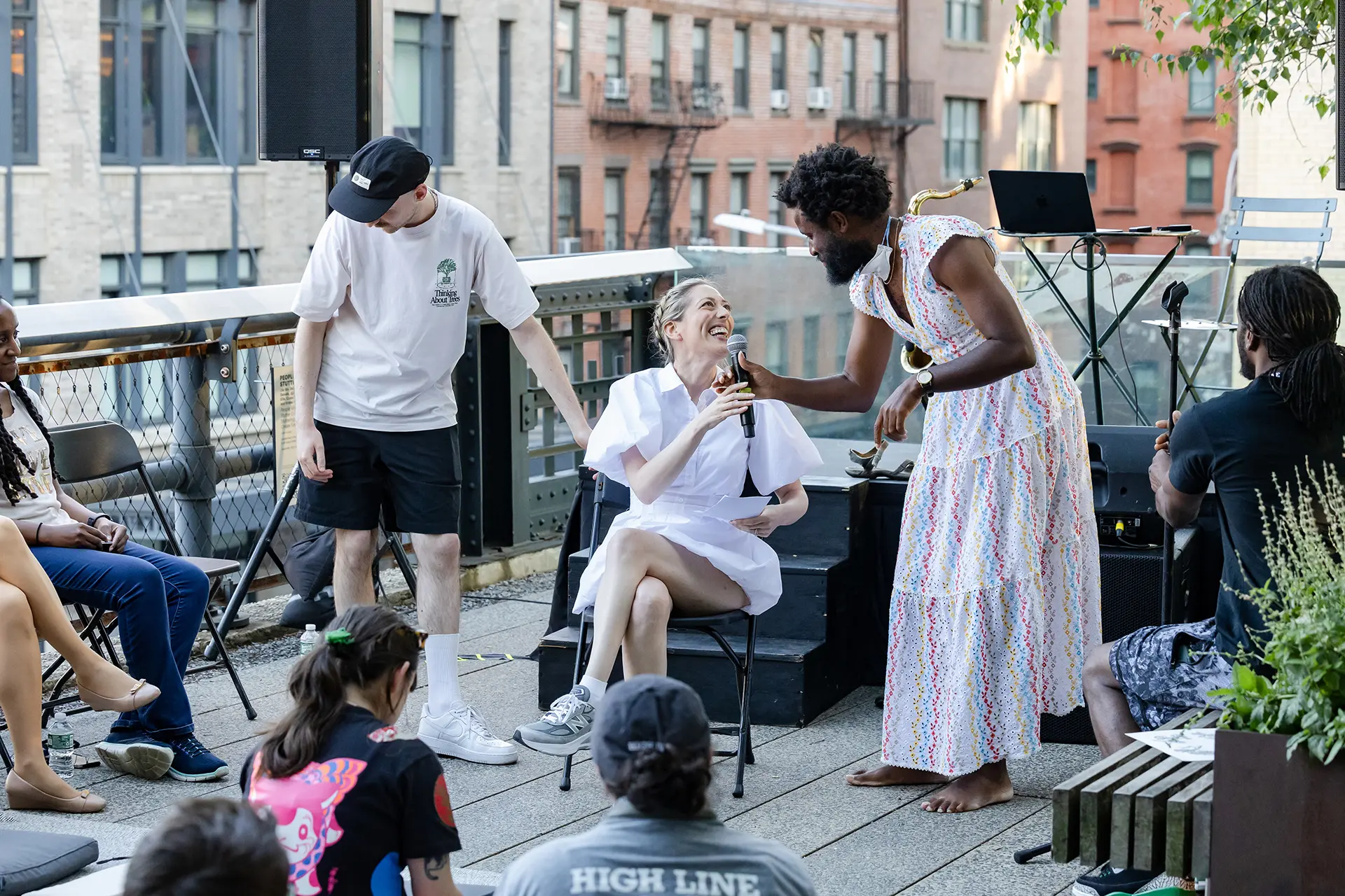
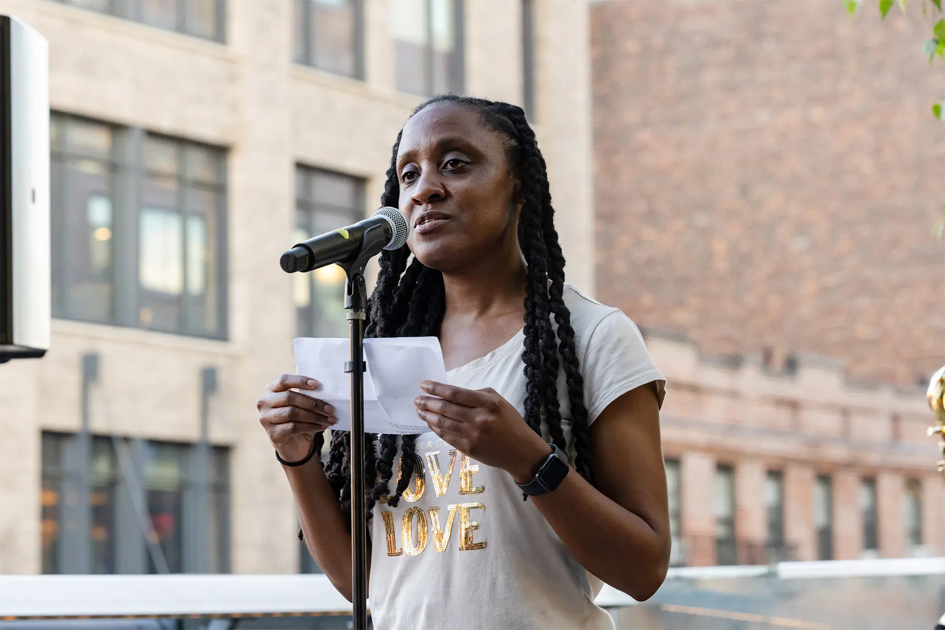
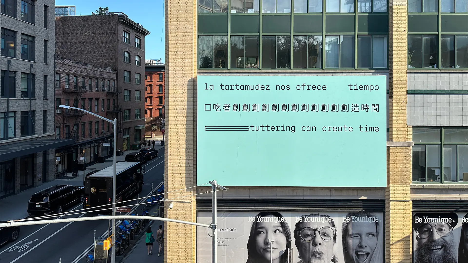
What does it mean to ‘create time’? Stuttering can open up space—and time—to find reflection, possibility and potential in repetitions, prolongations and pauses, making room for deep listening and connection.
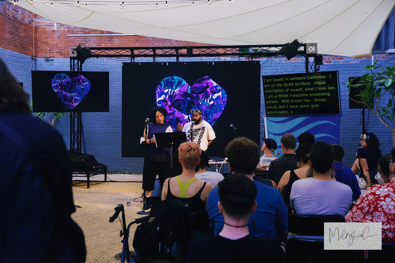
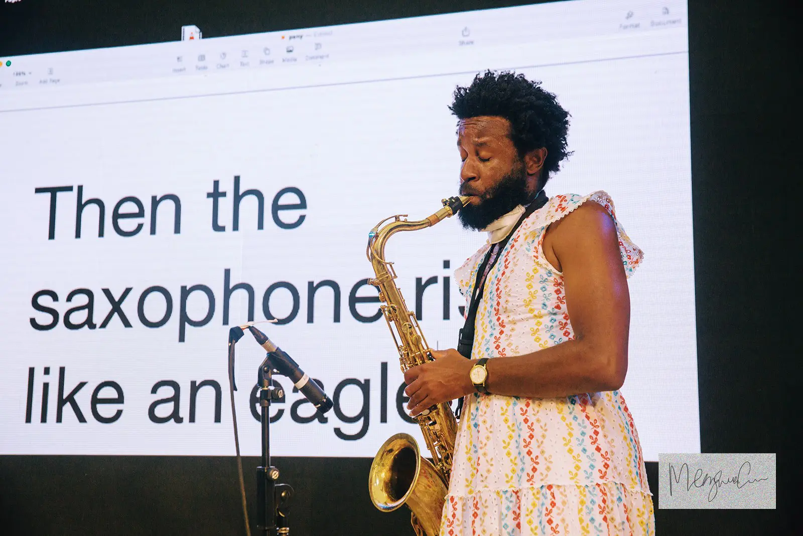
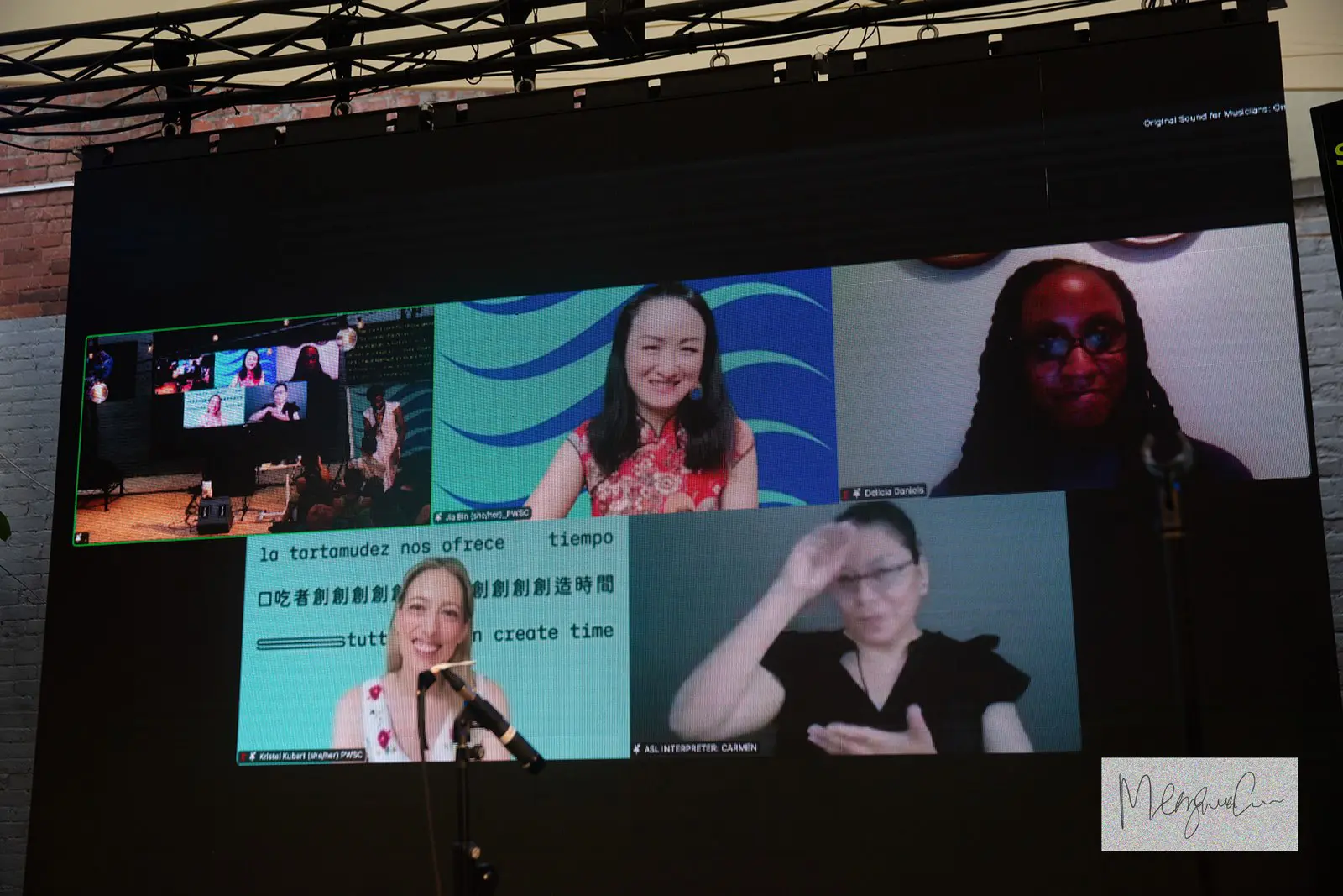
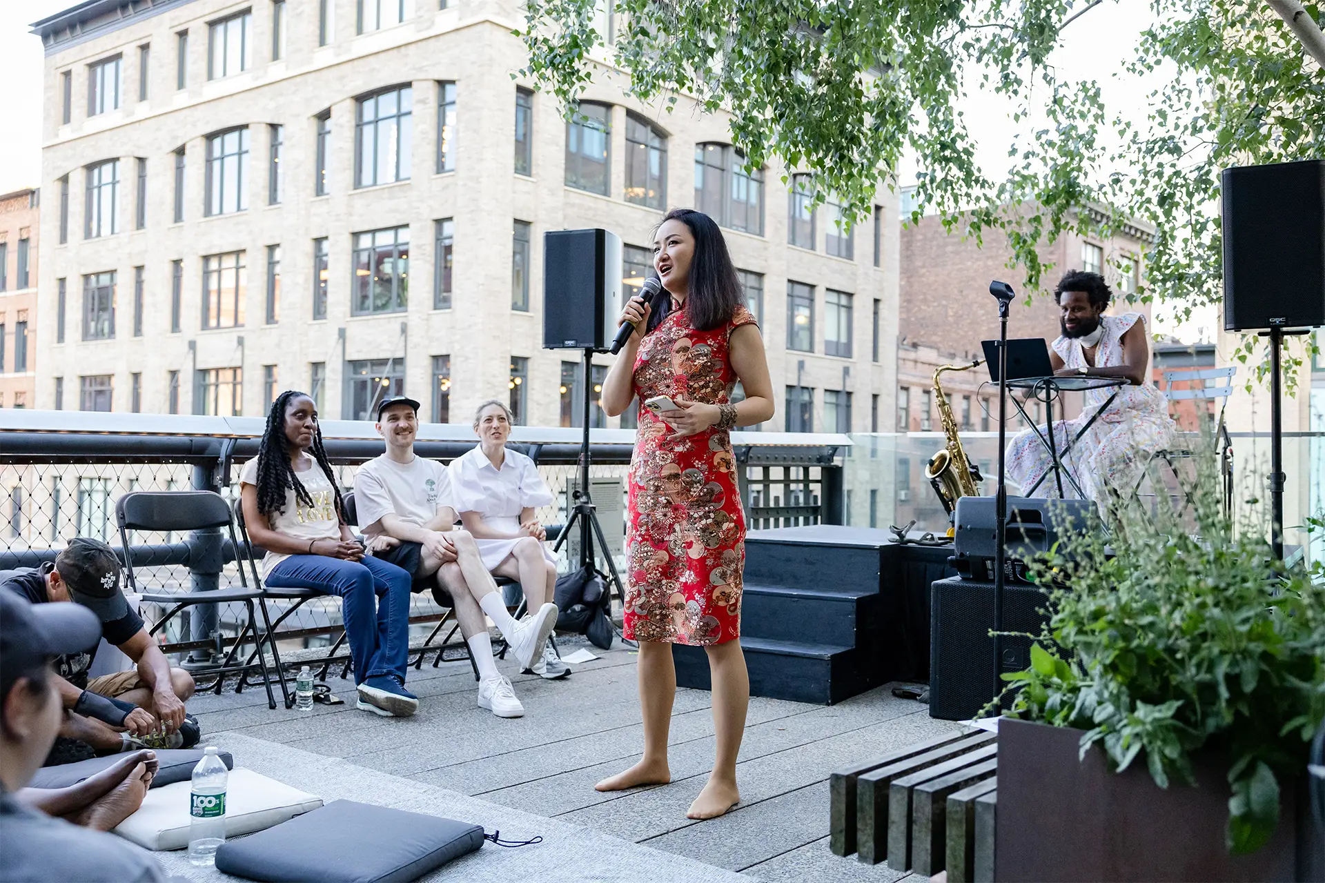
As the collective People Who Stutter Create, we mobilised the Whitney’s exhibition billboard as a place to publicly celebrate the transformational space of dysfluency, a term that can encompass stuttering/stammering and other communication differences such as aphasia, Tourette’s, and dysarthria.
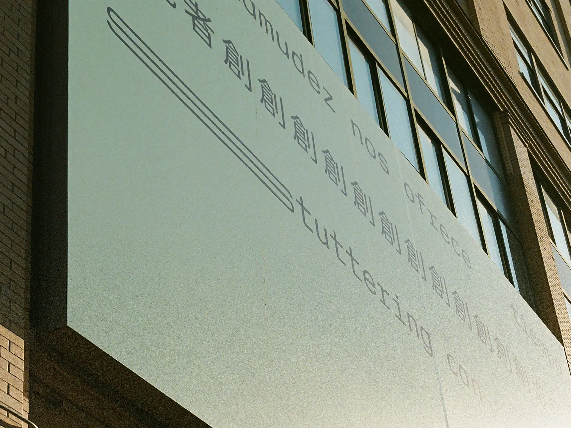
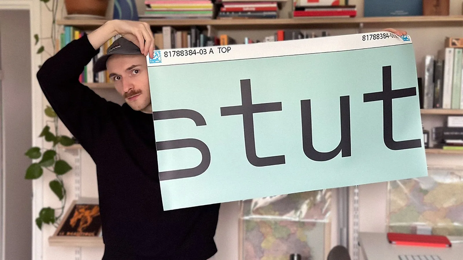
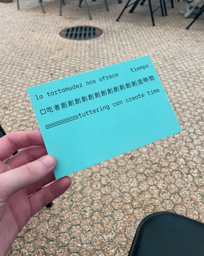
The design is inspired by the work of Jenny Holzer and Alisha B. Wormsley. Both have used striking statements in their work along with typographic simplicity. We used the typeface Dysfluent Mono, which emulates or represents stuttering in typographic form.
The lowercase typography is intentional: we wanted the statements feeling warm, welcoming, accessible and familiar, like a text from a friend. We used the green background colour to give a quality of warmth that stark black and white may not be able to provide. Green has long been used in the stuttering community worldwide as a point of representation.
Delicia Daniels
JJJJJerome Ellis
Conor Foran
Kristel Kubart
Jia Bin
James Harrison Monaco
Argenis Ovalles
Wendy Palomeque
Glow Sans TC by Celestial Phineas
